UI CASE STUDY
Trana App
A responsive, custom at-home fitness web app, designed to motivate people to find a routine to fit their level, schedule and interests.
Role
UI Designer
Timeline
May – August 2021
Tools Used
-
Balsamiq
-
Sketch
-
Adobe Illustrator
-
InVision
-
Framer

The Problem
For people who are new or returning to fitness, finding exercise routines for their interests, level, and schedule can be challenging.
Finding a suitable fitness regimen takes work. There’s a plethora of fitness apps to sift through on the market. Some fitness apps require a large time commitment, while others don’t provide enough motivation.

The Goal
Design a responsive web app to motivate people into a sustainable exercise routine by providing numerous types of workouts with assorted timeframes, incentives for completing workout challenges, ability to schedule classes, and track progress and goals.
The Process

UNDERSTANDING THE USER
User Persona & User Stories


FOUNDATIONAL DESIGN
Refined
User Flows & Low-Fidelity Wireframes
Created a user flow based on user stories and then built low-fidelity wireframes. A low-fidelity prototype was tested and revised.
As the target user is a beginner to working out and wants to build positive habits, it was important to focus on features that could help beginners stay motivated and that fit into their busy schedules, such as providing incentives for completing exercise challenges, tracking progress over time, and scheduling exercises. All these features were incorporated into the user flow.
Using the user flow as a foundation, low-fidelity mobile wireframes were created in Balsamiq. To test the user flows, a low-fidelity prototype in InVision was created. This prototype was tested with three participants and helped identify additional onboarding pages and feature touch points needed and streamline the scheduling feature. Below are the revised user flow and wireframes incorporating these results, which made the experience more user friendly.

Mid-Fidelity Wireframes
After revising the low-fidelity wireframes and applying more foundational design principles, mid-fidelity wireframes were created in Sketch.
For this phase of the project, a grid specification was first selected to determine the organization of the interface contents. Common UI elements were then added or improved upon based on best practices. UI design patterns were researched and incorporated into the design to make them more recognizable and clearer to users. After, visual hierarchy and spacing principles were applied to position text and the UI elements.
Onboarding

Dashboard

Filters

Activity

DEFINING THE STYLE
Mood Boards
To help guide the visual direction of Trana, two distinct mood boards were created and considered.
As both these mood boards present feelings targeting different user groups, mood board #2 was chosen. This option conveys a welcoming, inviting and approachable atmosphere, which will make our beginner target demographic feel comfortable exercising.
Mood Board #1

Mood Board #2 (Chosen Option)


Style Guide
Compiled a style guide to document Trana’s brand, visual, and UI elements.
Once the visual direction was established, Trana’s typography, color, imagery, shapes and iconography styles were defined and applied to the interface. These styles were then captured in a visual style guide, which can either be handed off to developers and/or future designer(s) working on the project. Below are some elements included in the guide.

REFINING THE DESIGN
Interactions and Gestures
Defined the interactions and gestures for the app to indicate how users will interact with the designs.
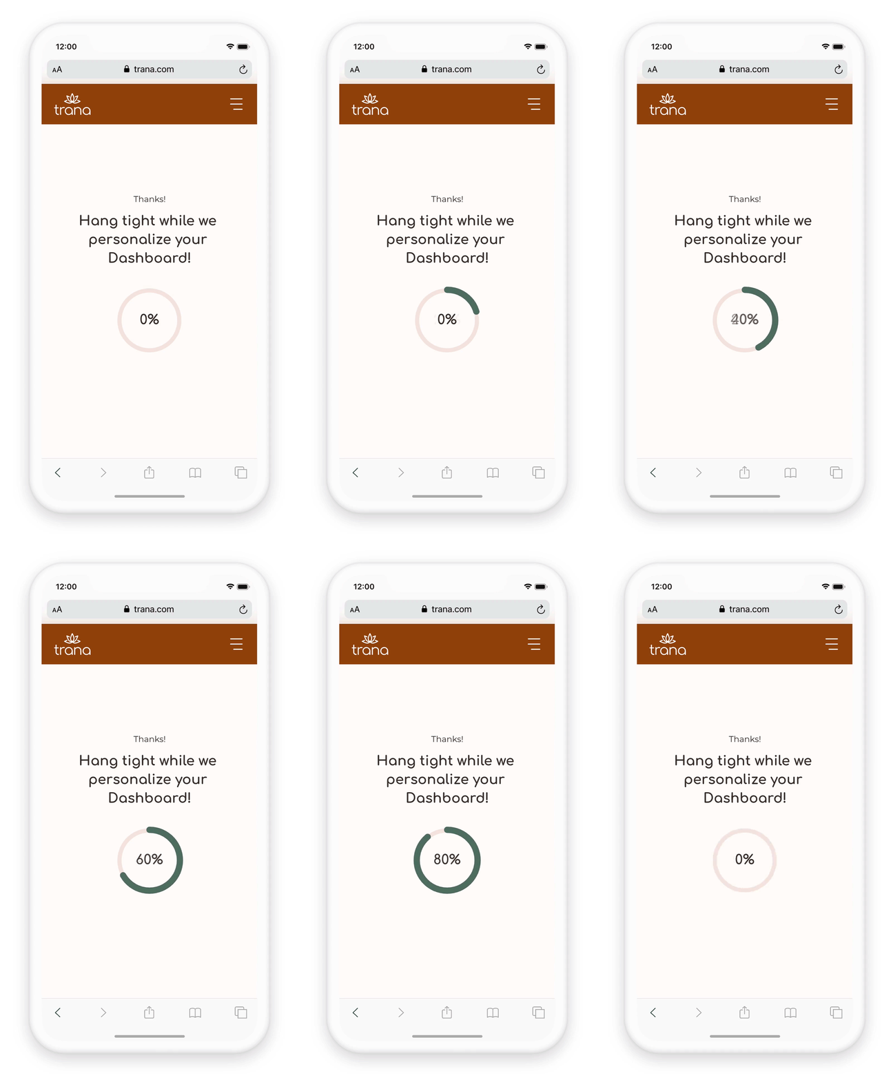
For the mobile app, the gestures used are simple and straightforward; using common ones such as, tap, swipe, vertical and horizontal scroll. To accompany the interactions and gestures, an animation of the loading screen was created as well.

Animation and Vertical Scrolling Gestures

Different Breakpoints
Since Trana is a responsive web app, different breakpoints were determined and designed for.
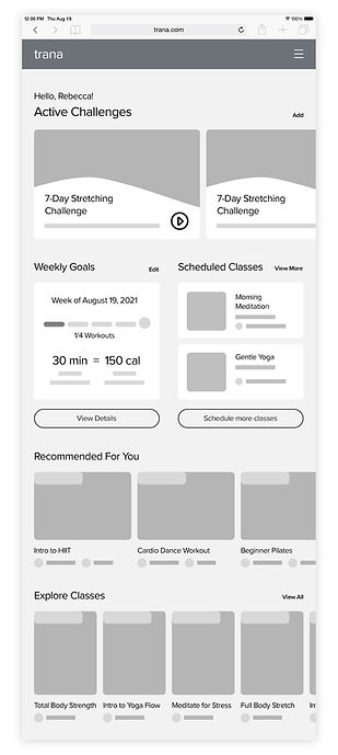
As our target user needs to be able to access Trana from different devices due to a busy schedule, it was important for the app to be accessible from different breakpoints. Below are the breakpoint grid structures and how the dashboard mobile screen was adapted to tablet and desktop.
Breakpoints and Grids
Mobile – 414px

Tablet – 768px
Desktop – 1024px
Low-Fidelity Wireframes – Dashboard
Mid-Fidelity Wireframes – Dashboard
Mobile

Tablet

Desktop

Mobile

Tablet

Desktop

Final Design
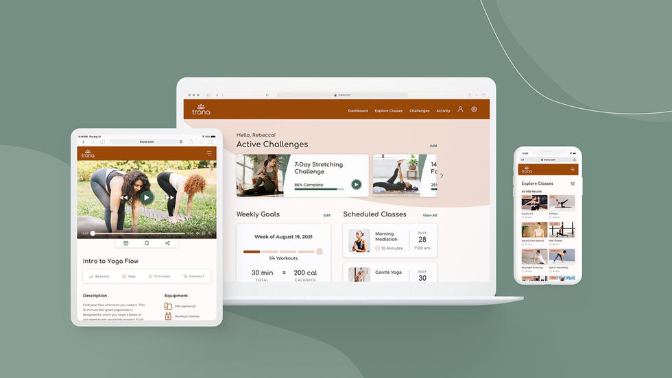
After the responsive breakpoints were designed for, the final screens were complete.
Design mockups were created in the three breakpoints to show a more accurate representation of how a user would see them. Finally, a clickable mobile prototype was constructed to illustrate the main user flows and features of the app.


